
CONVY
- Valentino Spadoni
- Dec 17, 2025
- 2 min read

Updated: Apr 17
I’d like to share my experience working with MH Material Handling, an Italian excellence in industrial conveyor belts and material-handling solutions.
Of course, we’re talking about a niche field. https://www.mhmaterialhandling.com/ MH wanted a mascot that could make the brand instantly recognizable and help it stand out from competitors. We kept the collaboration lean and moved quickly from kickoff to final delivery.
Here are the main steps of the project. Concept
I started from the conveyor belt itself. In my opinion, the simplest—and most effective—approach is to build directly from the product. When it comes to visual communication—illustration, comics, and mascots—we often rely on familiar visual cues and stereotypes, even when the goal is to update them (but that’s a much bigger topic for another time).
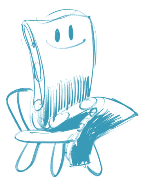

MH’s team had a brilliant intuition: comparing the conveyor belt to a snake. I decided to lean into that analogy.
After a series of pencil sketches, I selected the strongest ideas and developed them digitally on my graphic tablet.

I explored how to take advantage of the conveyor belt’s “anatomy.” Its shape is incredibly useful: it allows the character to gesture, point, and even hold objects—despite having no arms or legs.
In this case, a classic small anthropomorphic robot wouldn’t have preserved MH’s identity. Instead, it felt right to use the internal structure—especially the rollers visible on the sides—to subtly suggest snake skin without overdoing it.
In this early sketch I also suggested the name Rolly, inspired by the belt’s rollers. Proposals
I presented two mascot options—one of them in two eye variants.
In the first option, the face is more expressive and strongly characterized. In the second, it’s softer and more delicate. With proposal #2, I flipped the “direction” of the belt and used the rollers as big eyes, creating a cute, slightly kawaii-inspired look.

The client’s choice
MH preferred the first proposal—the more cartoonish, expressive, and (in a way) bolder one. So in the next step I refined the design and corrected details to move beyond the rough sketch.
The green skin and the red inside the mouth reflect the company’s brand colors.
At this stage, the client suggested the name CONVY (“conveyor” is the English word for conveyor belt). It was a great idea, and I was happy to go with it.
Since we completed the work with Christmas approaching, I also created a holiday pose—perfect for seasonal greetings to send to clients.

Conclusion
MH selected the poses to officially launch the mascot, and I produced the final, publish-ready artwork.
The linework is clean and consistent, and the colors are enriched with all the necessary shadows, highlights, reflections, and gradients.
Meet Convy!
Both MH Material Handling and I were very happy with the result. I hope you like it too :)


Comments